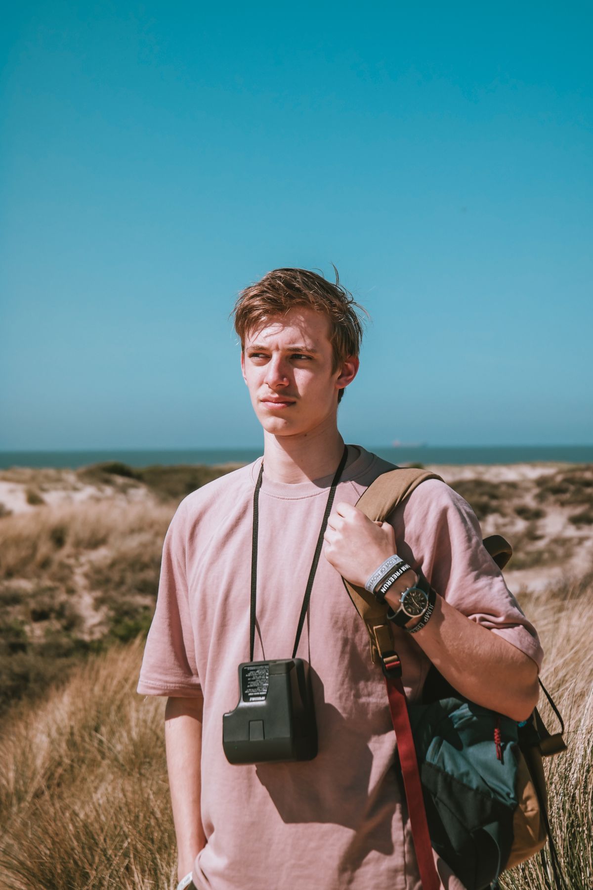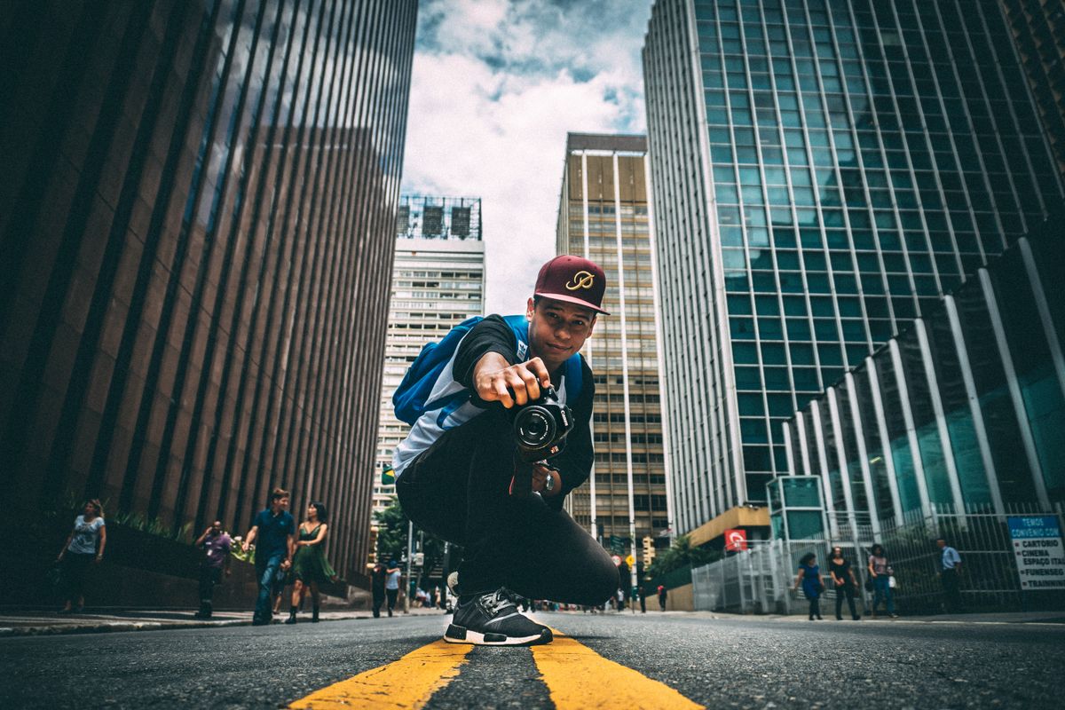
Color grading is where a photo moves beyond technical correction and gains an emotional atmosphere. The same frame can express melancholy with cool blue tones or nostalgia with warm amber. Shooting in RAW maximises this flexibility, because colour data is preserved without compression.
RAW, White Balance and Skin Tone
A good workflow starts with correct white balance, then balances exposure and contrast. Keeping skin tones natural is the most critical step; over-saturation makes skin look artificial. For a consistent visual signature, turning the same editing choices into a preset makes an entire series cohesive.
Colour Theory Applied to Photography
Warm tones (orange, yellow, gold) transport the viewer to an organic and emotional place. Cool tones (blue, teal, purple) give a powerful, modern feel. Complementary colours (e.g. orange–blue) create sharp colour contrast. Analogous colours (adjacent on the spectrum) provide a harmonious and calm palette. Before building a colour palette, identify the main storyline and the emotion the photograph conveys.
Lightroom vs. Capture One
Lightroom has become the standard for professionals and hobbyists alike thanks to cloud sync and an approachable interface. Capture One leads in raw colour engine power, tethered shooting support and skin-tone handling. Lightroom's HSL panel is excellent for selective colour adjustments. Capture One's layer-based editing system is a step ahead in masking precision. Try both and choose based on your workflow and device ecosystem.
Creating and Using Presets
Build a custom preset pack for brand consistency. A preset typically covers tone curve, HSL settings, colour grade and lens corrections. Apply presets gently, starting from the original image, and complete them with image-specific fine-tuning. Rather than copying purchased presets, adapt them to your own style. A categorised preset library offers major advantages in speed and consistency.
Batch Editing and Smart Collections
Editing every photo in a shoot individually is inefficient. In Lightroom, edit a reference photo, then sync or batch-copy settings to other selected photos. The flag system and colour labels speed up selection. Smart collections (e.g. 5-star, red-labelled) are ideal for portfolio management and delivery lists. Save batch export profiles in advance too.
Exporting for Platforms
Instagram, websites and print each require different colour profiles and resolutions. Use the sRGB colour profile and 72–96 dpi for web. Adobe RGB (1998) or ProPhoto RGB and a minimum of 300 dpi are recommended for print. A JPEG quality setting of 80–90 balances file size and quality. Prepare a separate export profile for each platform so you never have to enter settings manually.
Common Mistakes and How to Avoid Them
Over-saturation and giving crying-face portraits an orange skin tone are among the most common colour-editing errors. Monitor the luma and saturation channels separately. Excessive Clarity makes images look plastic and harsh. Always check the histogram; clipping in the blacks and whites destroys colour tone. Colour adjustments made without monitor calibration look wrong on other screens.
Photostorio: On Photostorio you can compare specialist photographers, studios and models, browse their portfolios and book online.
','ipucu','color grading, editing, lightroom, post production','Color Grading Guide 2026 | Photostorio